Kitchen Design Ideas
I gave my Work area aka the Kitchen a good review and a good cleaning to make sure it was more functional than a place to hold knick knacks.
If this is your first visit to my work horse, most of the cabinets are the original cabinets that were installed when this Ranch home was built in 1965. Upon moving in Hubby and I had out first debate and he won the "they'd look better" with ebony stain" discussion.
The butlers pantry shown below was added last year. This was one of my best ideas I have had about removing a wall and relocating the old entry.
If you'd like to read about that 5 part DIY you can start here with Part One a Butlers pantry.
As far as the ebony stain debate goes, well "G" may be in for a surprise but I am not going to be living with this ebony stain for much longer. I do like that touch of drama in a room and black does that, but not ebony stain. There are too many color variations in the grain for me and I want one consistent color.
So painting the kitchen and cabinets is on my wish list.
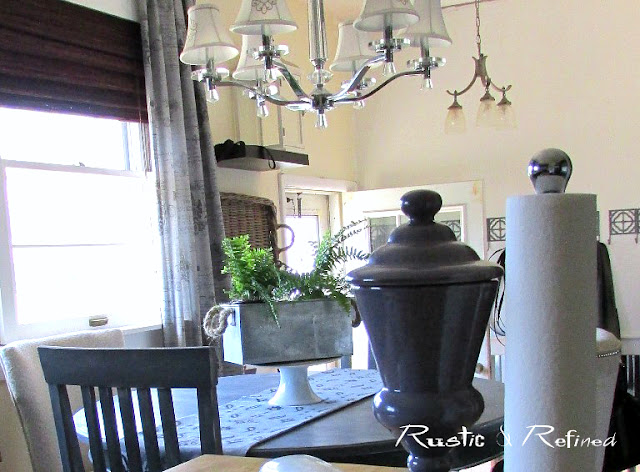
I kept the Seasonal touches for Spring to a minimum as this kitchen gets a workout and not cluttering it up makes it a lot easier to clean.
The butlers pantry is the main area where I like to add seasonal color and touches of personality.
This area along with storing food and extra pantry items also is our Coffee station and hold our microwave.
I hated having a microwave on my counters, and I am not a fan of it being above the stove.
One of the other updates I am thinking about making is taking out these upper cabinets you see below and using shelves.
Thee cabinets hold spices, storage containers, glass cooking dishes and mixing bowls. So currently I am trying to think how to "pretty" them up so they can be shown on open shelves, very visible to the eye when you walk in.
And right now tupperware sitting on a shelf?
Not pretty and not something I want to see when I walk in.
My plate and glass cabinet is another place I love to style up a bit with functional dishes.
Adding mirror to the backs was still a great idea and one I would use over and over if needed.
It is a cheap way to bounce sun light around a room
After finishing the back entry wall with new bright white paint, I am not wanting to repaint the kitchen walls the same color.
The creamy tones of the beige now bugs me to no end!
It seems like a yellowish hues on certain days. But maybe that's just me.
The windows got updated a couple of years ago, and if I had to do that kind of project again, it would be more cost effective just to buy new windows if we could install them ourselves.
But I did pick a pricey crown moulding for the tops of the windows, the rest of the wood bordering them is pre-primed pine.
I added two grey curtain panels and took out the black and white ones for Spring.
These look much softer in here.
Thanks for stopping by and I hope you've enjoyed my Spring Kitchen tour!


